MyPeerConnect
Everything, for everyone, is for no one.
- Role
- Product design, end to end
- Where
- Freelance product
- Year
- 2024
- Platform
- Responsive web
- Tools
- Figma, Design Systems, Responsive Web, Component Library
- 7Content types in one home
- 2Signals behind every rail
- 3Steps to set it up
- 15Optional interest topics
A feed that knows nothing about you
A working designer's professional reading is scattered across a dozen products, and none of them knows what they do for a living. The video platform serves what is popular, the job board what is recent, the journal database everything ever published. Each is a firehose pointed at everybody, and the sifting is charged to the reader.
The failure is not volume, it is address. None of those products can tell a UI designer in IT services from a marine biologist, so both get the same page — and once someone has been served enough irrelevant things they stop looking, which is the quiet way a content product dies. MyPeerConnect had to answer a narrower question: not what is popular, but what is relevant to this person, in this role, right now.
- Seven sources, seven places
- Popularity, not relevance
- No sense of who is reading
- Sifting is the user's job
The shape of the answer
What we knew, and what we assumed
Known, from the product and the build. The audience is working professionals with a role and an industry, most of them already on LinkedIn. They read across seven formats. They also publish, because the build includes posting, drafts and answering. Jobs earn their own tab, so career movement is part of why people come.
Assumed, and labelled as such because nobody tested it. That someone arriving from LinkedIn will accept role and industry being filled in for them. That relevance has to be stated in words to be believed. That scanning jobs and scanning journals want different densities. And that interests are a refinement rather than a barrier worth blocking signup with — the one I would test first, because if most people skip that step the personalisation rests on two signals, not three.
- Known: role, industry, seven formats
- Known: they publish too
- Assumed: LinkedIn is welcome
- Assumed: relevance must be stated
- Untested: do interests get used
Ask twice, then never ask again
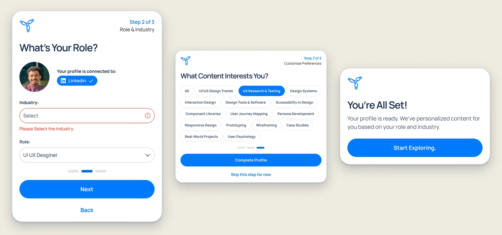
Personalisation dies at the setup screen. Every question asked before a person has seen any value is a chance for them to leave, so the onboarding takes two signals and treats everything else as optional.
LinkedIn brings the role with it, so step two really only asks for the industry, and it is the one required field on the whole path. Step three offers fifteen interest topics and a Skip this step for now sitting directly under the primary button. Then the product says what it did: We've personalized content for you based on your role and industry. Naming the mechanism is what makes the next screen legible as personal rather than generic.
- One required field
- LinkedIn does the typing
- Interests are skippable
- The system explains itself
Three steps, one of them optional
Seven rails, not one feed
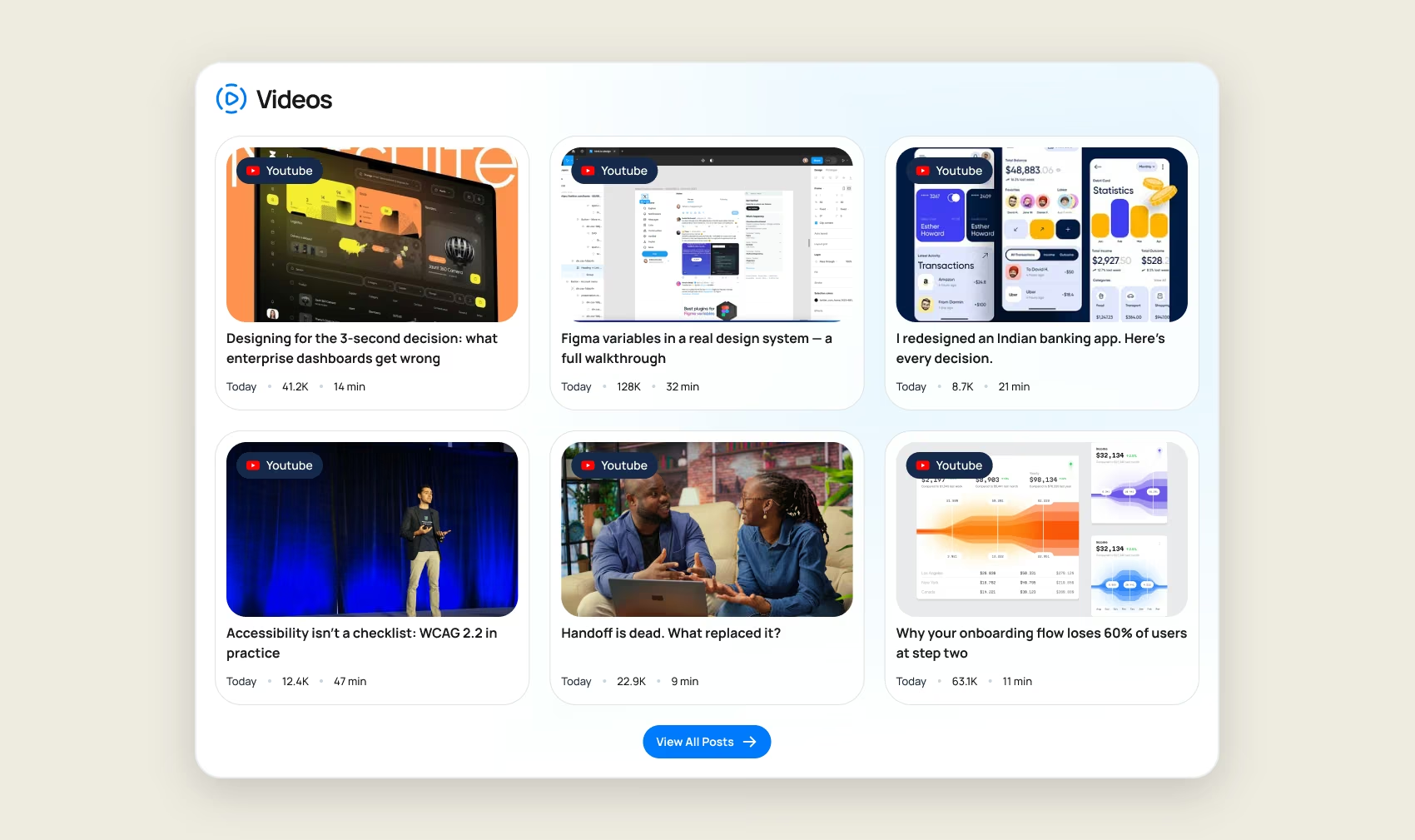
The obvious build is a single blended feed, and it is the wrong one. A mixed stream makes the reader re-orient at every card — this is a video, this is a job, this is a paper about Japanese flounder — and that switching cost is what makes aggregators exhausting.
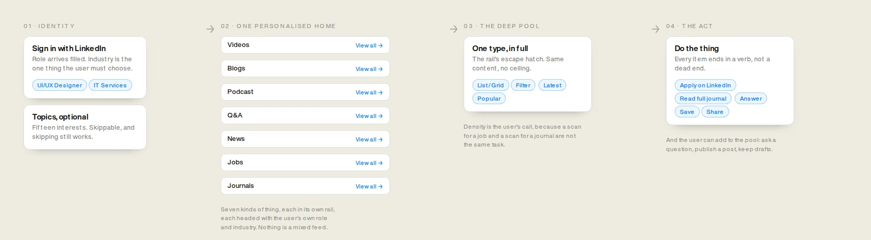
So the home page is seven typed rails in one scroll. Each has its own heading, its own card shape and its own way through to the full pool. The reader chooses the kind of attention they want to spend before they spend it.
Personalisation is claimed where the reader has already committed to a type: the news tab is headed Recent News for UI/UX Designers in IT Services, the jobs tab Find Your Next Opportunity, tailored to your industry and role. Once per destination rather than seven times per scroll, so it reads as a fact about the page instead of a slogan.
- Type before content
- One scroll, seven decisions
- Relevance stated where you land
- Each rail has an escape hatch
One rail, in full
The design direction
The interface has to disappear, because the content is the product and it arrives in seven shapes that already fight each other: video thumbnails, portrait photography, job listings, academic abstracts. So the chrome is near-white, #FAFBFB behind #FFFFFF cards, hairlines at #C7CCD4, and a single blue, #007AFF, doing every job that colour is asked to do. Nothing else is allowed to be blue, which is what lets a blue thing mean actionable anywhere on the page.
Type does the ranking. Headings heavy at #15294B, body at #5D5D5D, metadata smaller again — three levels applied identically in every card, so a reader who learns one card has learned all of them. A video card, a job card and a journal card hold completely different content and still share one spine: source, title, supporting line, metadata row, action. That spine is why seven types can stack without looking like seven products.
- #007AFF, and only for action
- Near-white chrome, white cards
- Three levels of type, everywhere
- One card spine, seven fills
The same content, two densities

Every card ends in a verb
Browse the build
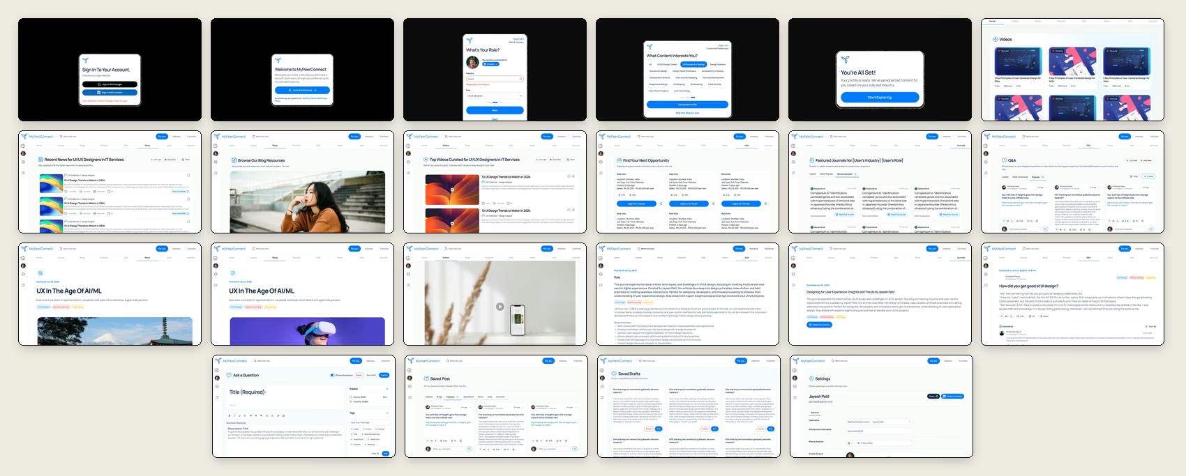
22 screensFilter by the part of the journey, then open any screen and scroll it at full length — onboarding, the home, the six feeds, the item pages, and the half people forget: what a reader does after they have found something.
The calls that shaped it
and what each one cost- 01
Personalisation needs data about the user, and asking for it is the most expensive thing you can do to someone who has not seen the product yet.
Take role and industry from LinkedIn and ask the user to confirm rather than type. Make the interests step skippable, with the escape right under the primary button.
Trade-offThe core signal now depends on a third party. Google sign-ins land in a thinner experience, and a LinkedIn outage is a personalisation outage.
- 02
Seven content types is either one blended feed, which is exhausting, or seven separate products, which is not a product.
One home of seven typed rails, each with its own card shape and its own way through to the pool behind it.
Trade-offThe home page is long, and the seventh rail is seen far less than the first. Ordering them becomes a permanent argument with no data to settle it.
- 03
A system that personalises silently gets no credit. The reader cannot tell a tailored feed from a lucky one.
Say it where the reader lands, in their own words: Recent News for UI/UX Designers in IT Services.
Trade-offThe copy is only as good as the signal. A stale role is now wrong in plain sight instead of hidden inside a ranking.
- 04
An aggregator that holds users inside it for actions it cannot complete wastes their time to protect its own numbers.
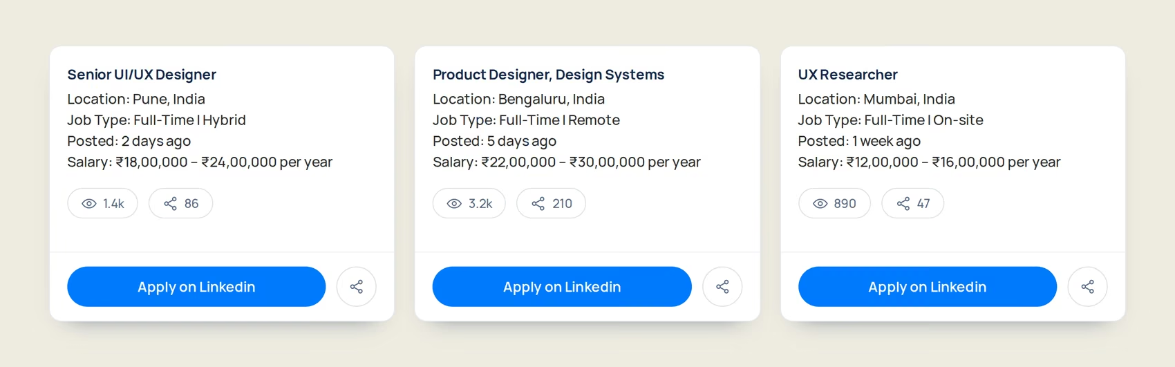
End items in real verbs that leave: Apply on LinkedIn, Read Full Journal, Listen on Spotify.
Trade-offSessions end at the moment of highest intent — the part of the funnel most products fight hardest to own.
Where it is still unresolved
open, and honestly so- 01
Role and industry are two coarse buckets. Every UI/UX designer in IT services sees the same seven rails as every other one.
Interests were added as a third, finer signal to break the tie inside a bucket.
Trade-offThey are optional, so they may barely exist in the data. Whether this is two signals or three is a question the design cannot answer without usage.
- 02
The onboarding promises personalisation before the system has any behaviour to learn from.
Lead with declared signals — role, industry, interests — because they work from the first session.
Trade-offDeclared preference ages badly. Nothing asks whether the role is still right six months later, and no feedback loop lets reading correct a wrong bucket.
- 03
Every rail assumes there is enough relevant content to fill it for any role and industry the reader picks.
Not solved in this phase. The screens show populated states only.
Trade-offA niche role meets thin rails, and the empty state for a personalised product is the hardest screen in it: it has to fail without making the reader feel unseen. Outstanding.
Where it got to
The product has a spine it did not have before: two signals collected once at the door, seven typed rails that state what they are addressing, a full pool behind each with the reader in charge of density, and an action at the end of every item that goes where the work actually happens. Twenty-two screens, including the parts that usually get skipped — sign-in errors, drafts, an anonymous posting identity, and a settings screen where the profile can be corrected.
That is a design outcome rather than a business one. Nothing here was instrumented: no usability testing, no launch metrics, no engagement data, and I am not going to borrow numbers from somewhere else to make this page look more finished than the work was. Whether interests get used, how the seven rails should be ordered, what happens when a bucket is too thin to fill — those are questions about behaviour, and answering them needs the product in front of people with analytics running.
Twenty-two screens